I love using vibrant colors in my design, but recently I noticed one thing: I didn’t consider enough a small group audience.
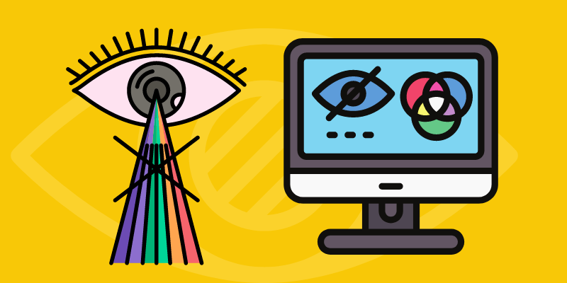
Color is one of the most important elements of design, I often use colors to attract attention. But what if part of our audience is color blind? It’s a crucial factor to consider for web design or data visualization because it can affect accessibility and navigation for color-blind viewers.
Don’t get me wrong, it doesn’t mean that we shouldn’t use colors in our design or you can’t be a designer if you’re color blind. Recently, I came across several color-blind designers and I got really interested in how it works for them to see and create designs.
So what color to avoid when designing for color blindness? The truth is, you don’t have to avoid any colors, instead, avoid certain color combinations and use color blind safe colors.
I spent days doing research and putting together this article for both color-blind designers and non-color-blind designers who can improve their designs for color-blind audiences.
What is Color Blindness
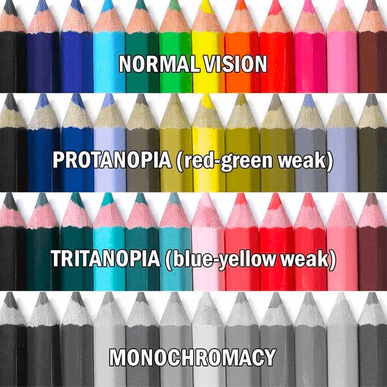
A simple explanation: Color blindness means when someone cannot see colors in the usual way. People with color blindness (or color deficiency) cannot distinguish certain colors, most commonly, green and red, but there are other types of color blindness too.
3 Common Types of Color Blindness
Red-Green color blindness is the most common color blind type, followed by blue-yellow color blindness, and complete color blindness. So, what do color-blind people see?
1. Red-green color blindness
They cannot tell the difference between green and red. There are also four types of red-green color blindness.
Normal color vision should see the first Santa in red and green, but color blindness can only see the version of the second or third Santa.
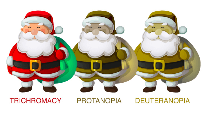
Deuteranomaly is the most common type of red-green color blindness and it makes green look redder. On the other hand, Protanomaly makes red look more green and less bright. Someone with Protanopia and deuteranopia can’t tell the difference between red and green at all.
2. Blue-yellow color blindness
Someone with blue-yellow color blindness typically can’t distinguish between blue and green, or yellow and red. This type of blue-yellow colorblind is known as Tritanomaly.
Another type of blue-yellow color blind people (also called Tritanopia), besides blue and green, also cannot tell the difference between purple and red, or yellow and pink.
3. Complete color blindness
Complete color blindness is also known as monochromacy. Unfortunately, someone with complete color blindness is not able to see any colors, but it’s not very common.
Are you color blind?
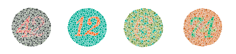
A quick way to find out is that you can do a quick color blindness test called Ishihara color plates, which you can find online. Here are some examples of the Ishihara test. Can you see the numbers (42, 12, 6, and 74) inside the circle plates between the dots?
But if you’re really getting a low score on color vision deficiency from different online color blind tests, it’s a good idea to see an ophthalmologist because online tests are not always 100% accurate.
Now that you know a bit about different types of color blindness, the next thing to learn is how to design for color blindness.
How to Design for Color Blindness (5 Tips)
There are different ways to improve design for color blindness, such as using colorblind-friendly color palettes, avoiding certain color combinations, using more symbols, etc.
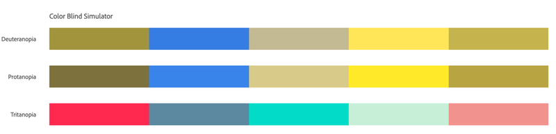
Tip #1: Use color-blind friendly palettes
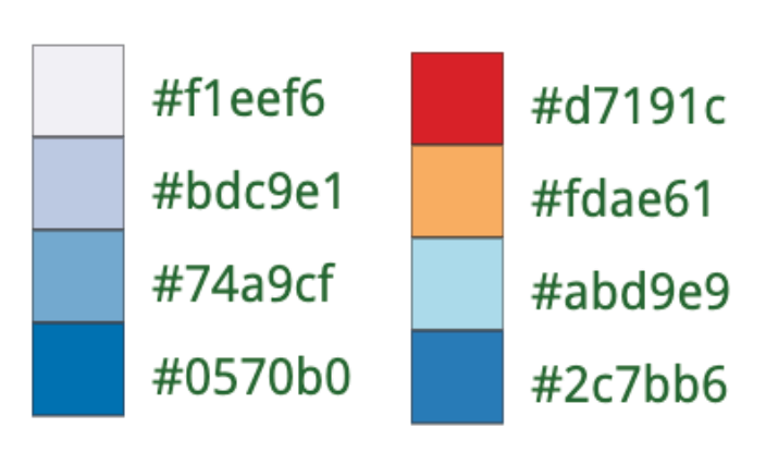
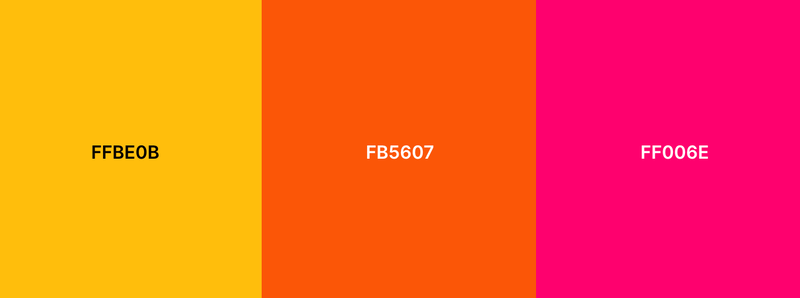
If you like the yellow color, lucky you! Yellow is a color-blind-friendly color and it makes a good combination with blue. If not, there are color tools like Coolers or ColorBrewer that you can use to help you choose color-blind colors.
For example, you can generate color-blind-friendly palettes easily on ColorBrewer.
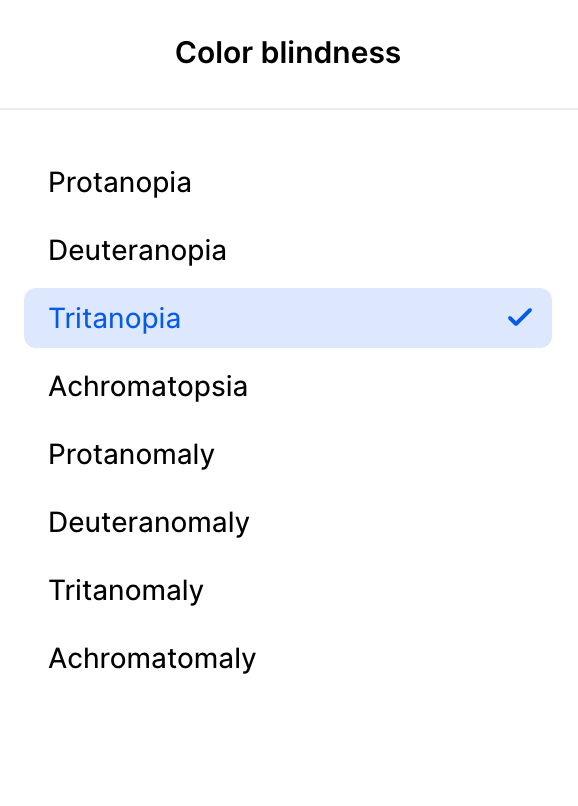
On Coolers, you can choose the type of color blindness, and the palette will adjust colors accordingly.
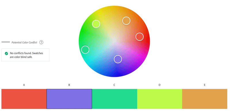
Adobe Color also has a color-blind simulator and you can choose the Color Blind Safe mode when choosing colors.
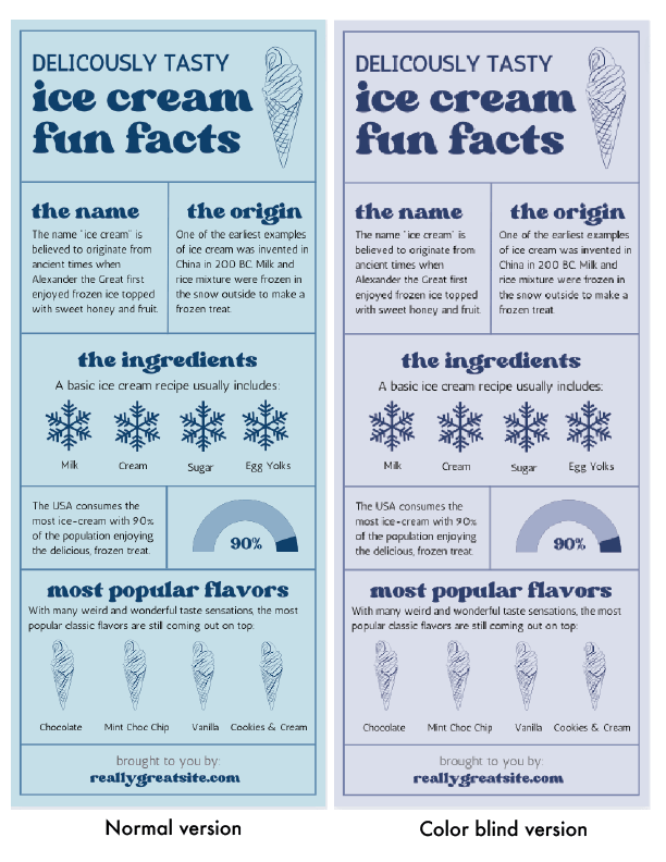
You can do a small test, print out the design in black and white, you can read all the information, then a color-blind person can read it too.
Tip #2: color combinations to avoid
Choosing the right color is essential when your audience is color blind. Some color combinations just wouldn’t work.
Here are six color combinations to avoid when designing for color blindness:
- Red & Green
- Green & Brown
- Green & Blue
- Blue & Gray
- Blue & Purple
- Red & Black
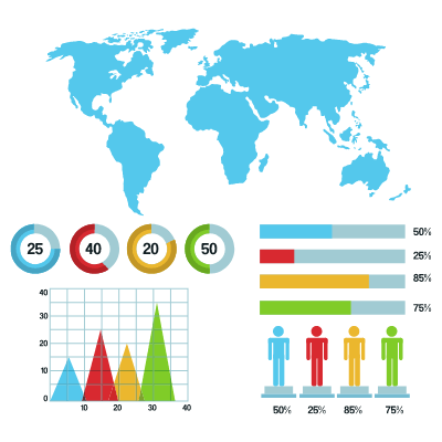
I’d say a lot of inconveniences come from graphs and charts. Colorful statistic charts and graphs are problematic for color-blind viewers because they might not see the corresponding colors for the data.
Web design, more specifically, buttons and links is another thing. Many buttons are either red or green, links are blue, or clicked links are purple. If there’s no underline below the anchor text, color-blind users would not see the link.
For example, Red-Green color blindness is the most common type of color blindness, so using the two colors together can be problematic.
But it doesn’t mean you can’t use the two colors together, because you can use other elements to differentiate the design, such as texture, shapes, or text.
Tip #3: Use strong contrast
Using high-contrast colors in your design can help color-blind viewers distinguish the context.
Let’s say you’re making a graph with different colors. When you use high contrast, even if a color-blind viewer cannot see the exact same color, at least he/she can understand the data is different.
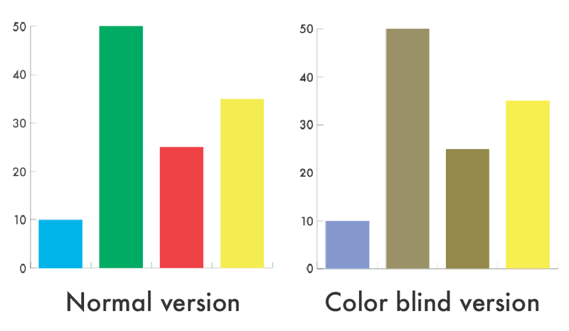
When you use similar colors, it can look confusing.
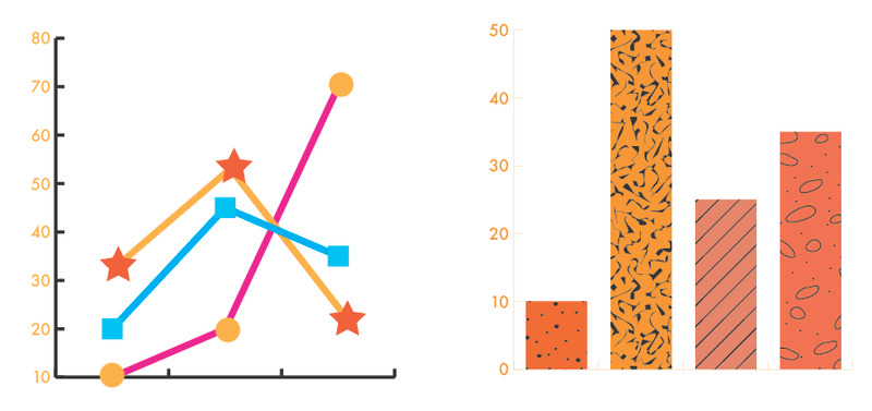
Tip #4: Use textures or shapes for graphs and charts
Instead of using different colors to show data, you can alternatively use shapes to mark the date. Using different types of lines to represent different data is also a good idea.
Tip #5: Use more text and icons
This is useful when you create infographics. Who says infographics have to be colorful always? You can use graphics to assist with visuals. Using bold text can also show the focus point and catch attention.
Using bold text is another good way to catch attention if colors don’t work.
Not sure how to check the color-blind version of your artwork in Adobe Illustrator? Keep reading.
Adobe Illustrator Color Blind Mode
Created a design in Adobe Illustrator and want to double-check if it’s color-blind friendly? You can quickly switch to view mode from the overhead menu.
Go to the overhead menu View > Proof Setup and you can choose between two color blindness modes: Color blindness – Protanopia-type or Color blindness – Deuteranopia-type.
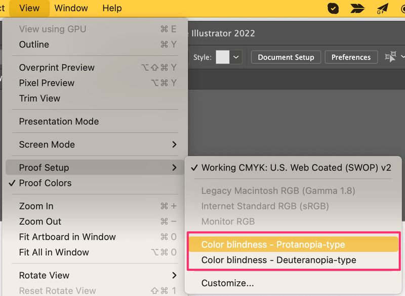
Now you can see what color-blind people see in your artwork.
Conclusion
See, it’s not that hard to design for color blindness and you can definitely create an awesome design that works for non-colorblind and color blind. Color is important, but other elements too. Using text and graphics to improve the visual is the best solution.
Sources: