Graphic design statistics show that 86% of customers say that brand authenticity affects their decisions in choosing and endorsing the products they want.
When talking about design or visual images, color and logos are the first things that attract attention. That’s why it’s important to learn and understand logos because interesting logos always help catch attention.
I’m a graphic designer with an advertising background and I’ve worked in ad agencies, tech companies, marketing agencies, and design studios.
From my working experience and hours of research, I have to say that logos have a great impact on businesses.
Not convincing?
Well, I’ve put together 19 logo statistics and facts including general logo statistics, logo design statistics, brand facts and some logo facts.
Why not see it for yourself?
Logo Design Statistics
Why is a logo so important for a brand or business? The answer is simple and proved by research. People process images faster than text and they often associate visual content with your business.
Here are some general logo statistics.
More than 60% of Fortune 500 companies use combination logos.
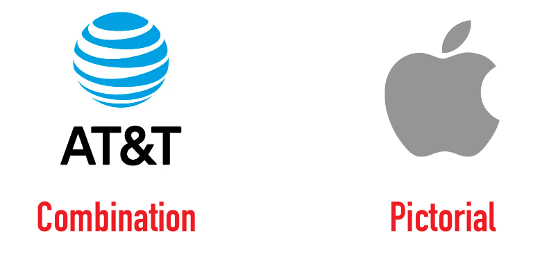
A combination logo is a logo that includes an icon and text. Most companies use it because it’s more versatile and recognizable. The only Fortune 500 logo that uses a stand-alone pictorial icon is Apple.
90% of the global population recognizes Coca-Cola’s logo.
The red and white Coca-Cola logo is one of the most recognizable logos in the world. Other famous and highly recognizable logos are Nike, Apple, Adidas, and Mercedes-Benz.
Rebranding your logo can have a great impact (good & bad) on the business.
Successful example: Starbucks
Do you remember the last Starbucks logo? It wasn’t bad but today’s new logo is definitely a success that we can learn from.
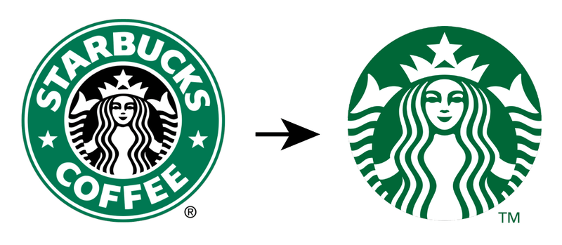
The new logo fits the modern trend and still keeps its original siren. Getting rid of the outer ring, text, and stars gives a cleaner look and sends a message that Starbucks offers more than just coffee.
Failed example: Gap
Gap redesigned its logo in 2010 after the financial crisis of 2008, and customers hated it. This rebranding not only upset some customers who went on social media to express their negative feelings toward the new logo but also cause a great loss in sales.
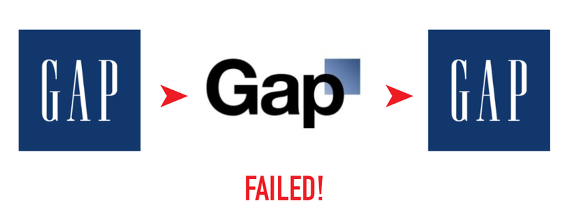
Six days later, Gap decided to change its logo back to the original one.
The Instagram logo has the highest search volume globally.
As one of the leading social media platforms today, the Instagram logo is searched 1.2 million times every month around the world. The second and third most searched logos are on YouTube and Facebook.
A logo affects women more than men when it comes to making purchase decisions.
About 29% of women and 24% of men surveyed claim that they are more likely to trust a business when the branding appearance, including the logo, is familiar to them.
On average, after seeing a logo 5 to 7 times, customers will remember the brand.
A logo communicates a brand’s personality so a lot of people associate the brand with its logo.
67% of small businesses are willing to pay $500 for a logo, and 18% would pay more than $1000.
It’s important for small businesses to stand out from the crowd, that’s why a unique logo design and branding are essential.
Logo Design Statistics
A professional and nice logo will not only show your brand image, and build trust, but also attract customers. That’s why companies are willing to invest in logo design.
See if you can get some ideas from here for rebranding.
40% of Fortune 500 companies use the color blue in their logos.
Blue seems to be the favorite color of the top 500 companies, followed by black (25%), red (16%), and green (7%).
See the numbers of companies that use blue, black, and red:

Most logos uses two colors.
Research shows that 108 of the top 250 companies use a combination of two colors in the company logo. 96 of the 250 use single color and 44 use more than three colors.
Logo shape matters.
Research shows that the shape of a logo can affect customers’ judgment of a brand. For example, brands love to use circles in their logos.
Circles often represent unity, wholeness, integration, global, perfection, etc.
San Serif font is the most popular font that the top 500 companies use on their logos.
367 among the top 500 companies use only San Serif font for their company logos. Another 32 company logos use the combination of Serif and San Serif fonts.
All caps are more used than title case in logo design.
47% of Fortune 500 companies use all caps in their logos. 33% use title case, 12% use random combinations, and 7% use all lowercase.
Logo Facts
Want to know the history of some of the famous logos? Did you know that the Coca-Cola logo was free? You’ll find some interesting facts about logo design in this section.
Stella Artois’s logo is the oldest logo first used in 1366.
Stella Artois was founded in Leuven, Belgium in 1366, and they have been using the same logo ever since.
The first Twitter logo cost $15.
Twitter bought a bird icon designed by Simon Oxley from iStock to use as their logo. However, in 2012, Twitter rebranded and made the logo more sophisticated.
The famous Coca-Cola logo cost $0.
Not all big brands have expensive logos. Here’s the proof! The first Coca-Cola logo was created by Frank M. Robison, Coca Cola founder’s partner, and bookkeeper.
A graphic design student created Nike’s logo for $35.
Nick’s logo was designed by Carolyn Davidson, a graphic designer from Portland State University. Although she only got a $35 payment initially, years later, eventually she was rewarded with $1 million.
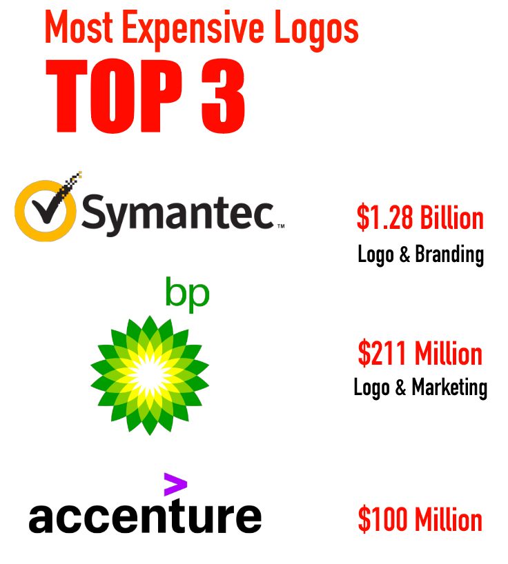
The top 3 world’s most expensive logos are Symantec, British Petroleum, and Accenture.
Baskin Robbins’s logo implies the 31 flavors of ice cream they have.
Baskin Robbins is an American ice cream chain. From the letters B and R, you can see the pink areas showing the number 31.
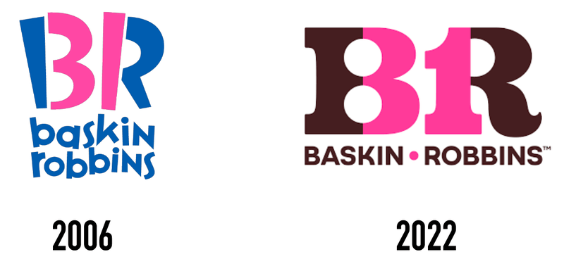
You’re probably quite familiar with the blue and pink version of the logo. However, they’ve just re-designed its logo to honor its first logo created in 1947. So they changed the logo colors back to chocolate and pink.
The “smile” on the Amazon logo implies they offer everything.
The first thing that comes to mind when you see the “smile” below Amazon’s wordmark you’d probably associate with customer satisfaction because it’s a smile. Makes sense.

However, if you pay closer attention, the arrow (smile) points from A to Z, which actually sends a message that they offer different things in all categories.
Logo FAQs
Want to learn more about logos or logo design? Here are more logo basics that you might want to know.
What are the golden rules of logo design?
- Create something that tells what you do.
- Choose the right shape.
- Use the font that suits your branding.
- Choose color wisely. Dig in to learn more about color psychology.
- Be original. Don’t copy other brands.
- Keep it simple so that you can use it in different ways (print, digital, product, etc)
- Take your time! Don’t rush to create a logo that wouldn’t work.
What are the five types of logos?
The five types of logos are combination logo (icon & text), wordmark/letter mark (text only or text tweak), pictorial mark (icon-only), abstract mark (icon-only), and emblem (text within shapes).
How do logos attract customers?
A good logo design benefits a brand. It attracts attention, differentiates from competitors, and affects customers’ buying decisions.
What are the five characteristics of a good logo?
Simple, memorable, timeless, versatile, and relevant.
Wrapping Up
I know it’s a lot of information, so here’s a quick sum up.
Logo design is important for a business. Important elements to consider when designing a logo are color, shape, and font. And Oh! Don’t forget the most important rule: your logo should tell what you do!
Hope the logo statistics and facts above can help you get more ideas for your business.
References:
- https://www.tailorbrands.com/blog/starbucks-logo
- https://colibriwp.com/blog/round-and-circular-logos/
- https://www.cnbc.com/2015/05/01/13-famous-logos-that-require-a-double-take.html
- https://www.businessinsider.com/first-twitter-logo-cost-less-than-20-2014-8
- https://www.rd.com/article/baskin-robbins-logo/
- https://www.websiteplanet.com/blog/logo-design-stats/
