Drop shadow is an effect that you can easily apply to your objects or texts in Adobe Illustrator. I use this technique all the time to highlight text in my design. I know you’re probably thinking how can I shadow highlight something? Well, you’ll see.
In this article, I’m going to show you how to add a drop shadow in Illustrator and explain the setting options for the shadow.
Why do we add drop shadows to objects or text? Let’s take a look at the example below.

See that the text isn’t 100% readable on the image but it’s a nice color combination. An easy solution is to add a drop shadow to the text. It’ll make the text stand out (I mean readable) and blend in well with the image.
Want to see the transformation? Keep reading.
Adding Drop Shadow in Adobe Illustrator
You can add drop shadow in two steps, basically, just select the effect and adjust the settings.
Note: the screenshots are taken from Adobe Illustrator CC Mac version. Windows or other versions can look different.
Step 1: Select the object, go to the overhead menu and select Effect > Stylize > Drop Shadow.
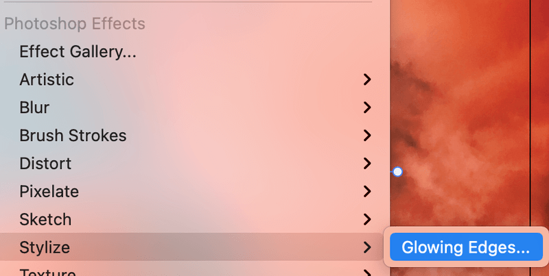
Note: There are two Stylize options from the Effect menu, you’ll choose the one under Illustrator Effects.
The Stylize option from Photoshop Effects is for applying the Glowing Edges effect.
As you can see, after you click on the Drop Shadow option, a setting box will appear and a standard drop shadow is added to your object, in my case, the text.
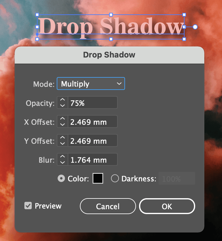
Step 2: Adjust the settings of the shadow if you’re not happy with the default one. There are a few things that you can change, including blending mode, the opacity of the shadow, X and Y offsets, Blurriness, and color of the shadow.
Quick Explanation of Drop Shadow Settings
The default shadow Mode is Multiply, that’s the one you’ll be using the most for the average drop shadow effect. But feel free to experiment with the options to create different effects.
You can adjust the Opacity of the shadow. The higher the value, the more obvious the effect. The preset opacity of 75% is a pretty good value.
The X and Y Offsets determine the direction and distance of the shadow. X Offset controls the horizontal shadow distance. The positive value applies shadow to the right, and negative to the left. Y Offset changes the vertical shadow distance. A positive value shows a shadow downwards, and negative shows a shadow upwards.
Blur I guess it’s pretty easy to understand. If you set the Blur value to 0, the shadow will look pretty sharp.
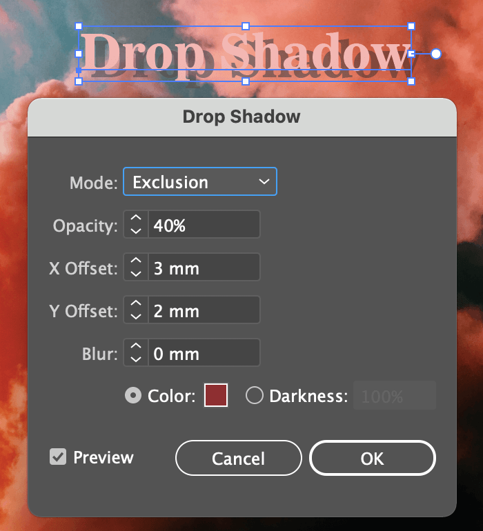
For example in this screenshot, I changed the Blur value to 0, slightly changed the Offset values, and the blending mode, and changed the shadow color to a wine color with lower opacity.
If you want to change the Color, simply click on the color box and the Color Picker window will open.
Tip: Make sure the Preview box is checked so you can see how the effect looks as you edit.
Have fun experimenting with the setting options.
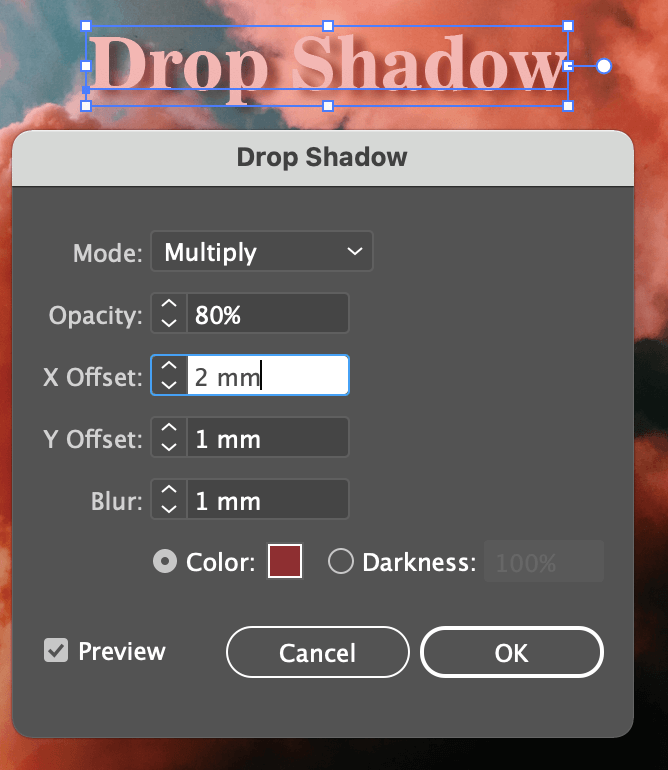
Ok, I think it looks pretty good now. Click the OK button and that’s how you add shadow to text to make it stand out from an image. You can use exactly the same way to add a drop shadow to objects in Adobe Illustrator.
If you want to remove a drop shadow, you can either undo it or delete the drop shadow effect on the Appearance panel.
One More Thing (Extra Tip)
The drop shadow effect you just created will be saved. So if you have multiple objects that you want to add the same drop shadow, you don’t have to go over the settings again.
Simply go to the overhead menu and select Effect > Apply Drop Shadow, the same effect will apply to your new objects.
That’s All for Today
Now you get what I meant by highlighting text with drop shadow right? It’s an easy solution to make the text or object more visible without changing the color. I know the struggle of finding the right color combination for a multi-color design, so I hope this solution works for you as well.


Emily
Wow, thanks for this! Originally, I had accidentally applied the Photoshop effect and was completely bamboozled as to what I had done haha. Thanks for writing this out so nice and clearly!! Keep up the great work.
June Escalada
You’re welcome, Emily! Thank you for reading!!
moj
I have an item with a shadow that I want to export as a PNG for a website, the problem is that when exporting as a PNG the shadow is turning a little bit white and you can spot the white on different BG colors,
June Escalada
Hi Moj, which color mode did you choose?