
Why is Adobe Illustrator ideal for making infographics? Lots of reasons.
Besides the fact that it has amazing tools for making vector graphics for the infographic, I love using Adobe Illustrator to create charts because it’s so easy to stylish charts and I can edit the charts easily.
There are ready-to-use graph tools that you can use to make a chart in just a few steps. Plus there are different options to style the charts.
In this tutorial, you’ll learn how to make different styles of pie charts, including a standard pie chart, donut pie chart, and 3D pie chart.
Note: all screenshots from this tutorial are taken from Adobe Illustrator CC Mac version. Windows or other versions can look different.
Where is the Pie Chart Tool in Adobe Illustrator
You can find the Pie Graph Tool on the same menu as other graph tools if you’re using the Advanced toolbar.
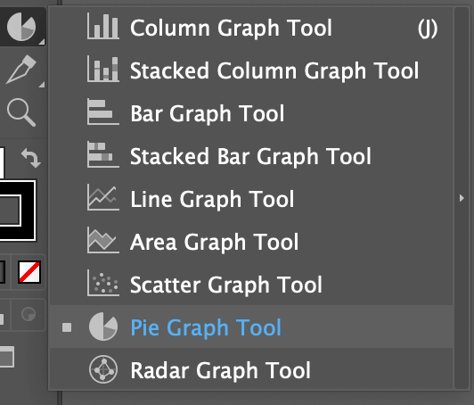
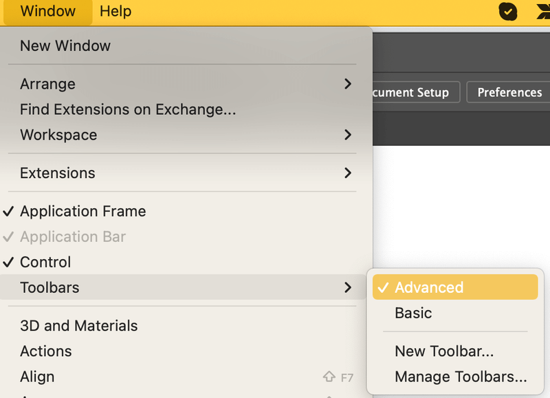
If you’re using the basic toolbar, you can quickly switch to the Advanced toolbar from the overhead menu Window > Toolbars > Advanced.
Now that you found the right tool, let’s go ahead and jump into the steps to make a pie chart in Adobe Illustrator.
How to Make a Pie Chart in Adobe Illustrator
It only takes a couple of steps to make a chart using the Pie Graph Tool.
Step 1: Create a pie chart. Choose the Pie Graph Tool from the toolbar and click on the artboard.
A graph setting window will pop up and you need to input the size of the chart.
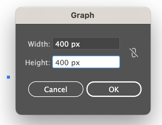
Type in the Width and Height values, and click OK.
You’ll see a circle (chart) and a table, so the next step is to input data into the table.
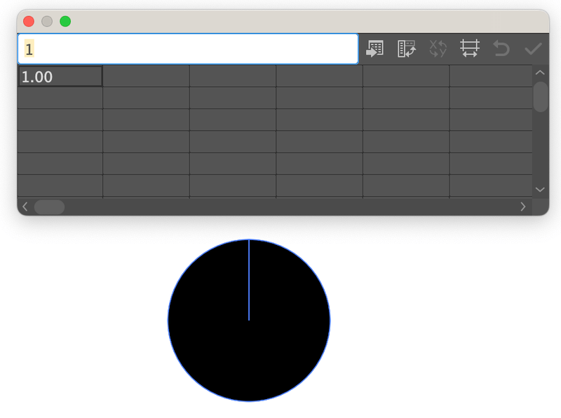
Step 2: Input the attributes. Click on the first box on the table and type in the attribute on the white bar above. Hit the Return or Enter key, and the attribute will show on the table.
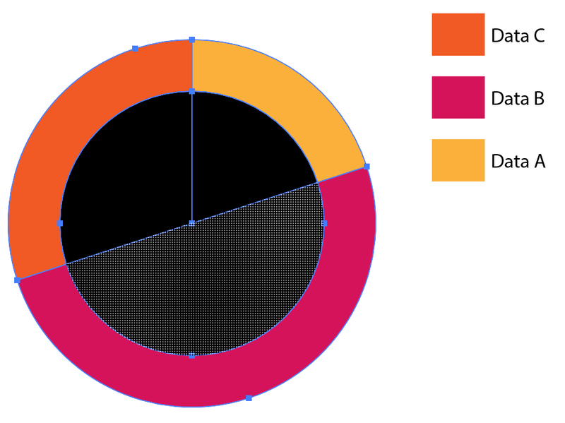
For example, you can put Data A, Data B, and Data C.
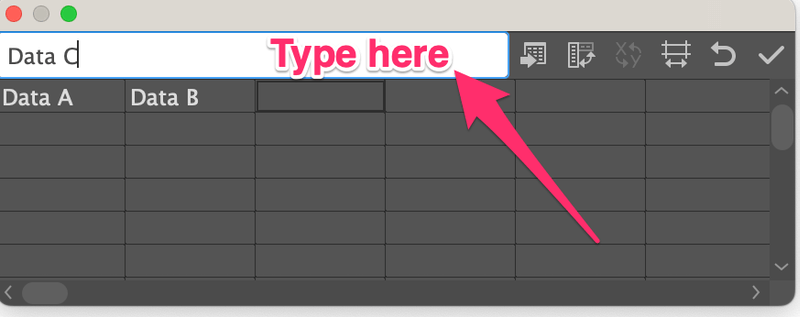
Then input the value of each attribute on the second row of the table.
For example, Date A is 20%, Data B is 50%, and Data C is 30%, so you can add the numbers 20, 50, and 30 under the correspondent data.
Note: the numbers must add up to 100.
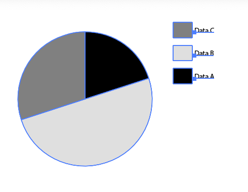
Click the Check symbol and you should see a pie chart like this.
Step 3: Close the graph table.
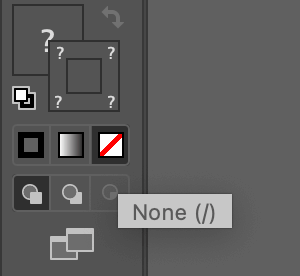
Step 4: Style and edit the pie chart. For example, you can change the color, or add text to the pie chart.
The first thing I would do is to get rid of the stroke color of the pie chart to make it look more modern.

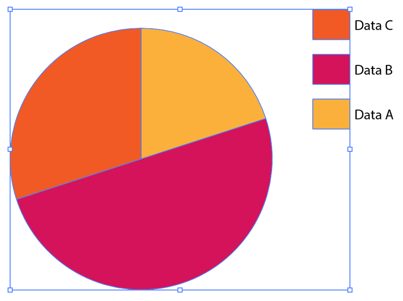
Then let’s change the pie chart’s color.
Use the Direct Selection tool to click on the black color on the pie chart and the black rectangle next to Data A.

Choose a color from the Swatches panel or use any other methods to fill the color.

Use the same method to change the color of data B and data C.

You can also edit the text of the data or manually add text to the pie chart.

Of course, there are different types of pie charts. Another popular version is a donut pie chart.
How to Make a Donut Pie Chart
I’ll show you how to make a donut pie chart from the pie chart we just created above. Before getting started, make sure that your data is correct. If you’re not 100% sure, duplicate the pie chart just in case you want to make changes later.
Step 1: Click on the pie chart, and go to the overhead menu Object > Ungroup. You’ll see a warning message, click Yes.

Now the shapes will be ungrouped from the text, but you’ll need to ungroup the shapes again.
So select the pie chart, right-click and choose Ungroup. You must ungroup the colors as well.
Step 2: Use the Ellipse tool (L) to make a circle and place it in the center of the pie chart.

Step 3: Select the pie chart and circle, and choose the Shape Builder tool (Shift + M) from the toolbar.
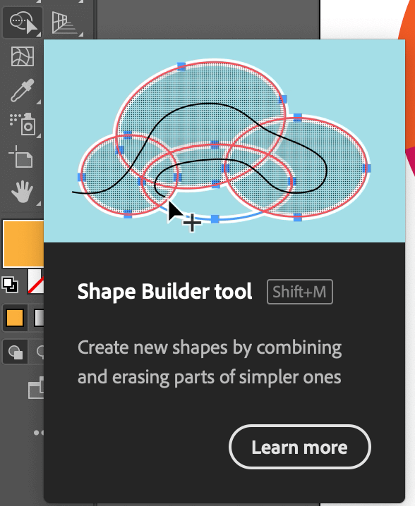
You can see part of the pie chart divided into three parts underneath the circle. Click and draw within the circle shape to combine the shapes within the circle.
Step 4: Select the circle and delete it once you’ve combined the shapes.

If a donut chart isn’t fancy enough, you can also make a 3D-looking one.
How to Make a 3D Pie Chart
Making a 3D pie chart is simply adding a 3D effect to your 2D pie chart. You can make the entire chart 3D, or only part of it 3D. Follow the steps below and see how it works.
Step 1: Create a pie chart. You can optionally choose to change the color before or after adding the 3D effect.
I’m going to use the pie chart above to show you an example.
Step 2: Ungroup the pie chart until all shapes are separated as individual shapes.
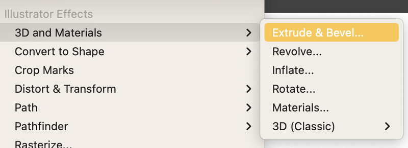
Step 3: Select the pie chart, go to the overhead menu Effect > 3D and Materials > Extrude & Bevel or you can choose the 3D (Classic) mode if you’re more familiar with it.
You’ll see a 3D version of the pie chart and the next step is to adjust the value of some of the settings.
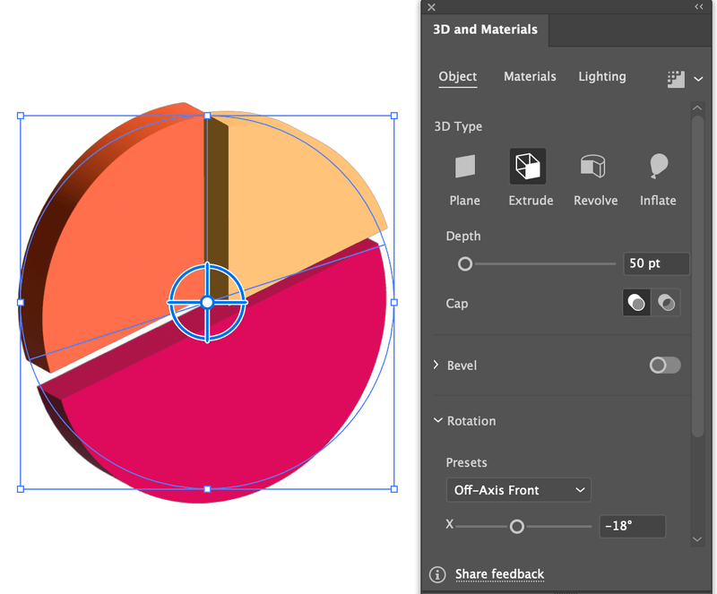
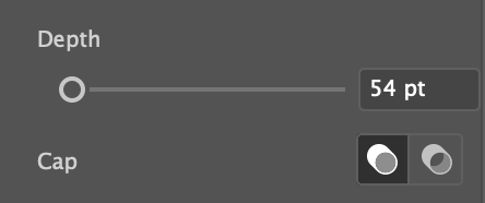
Step 4: Change the Depth value, the higher the number, the deeper the extrude level goes. I would say around 50 pt is a good value.
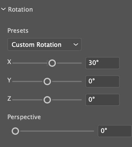
Then change the Rotation values. Set both Y and Z values to 0, and you can adjust the X value accordingly. You can also click on specific parts to add different values.
Here’s what I got. I also used the Direct Selection tool to move the yellow pie shape a bit.

Once you’re happy with the look, select the pie chart, and go to the overhead menu Object > Expand Appearance. This will get you out of the 3D editing mode.
Conclusion
You can quickly make a pie chart in Adobe Illustrator using the Pie Graph Tool and you can edit the chart with the Direct Selection tool. Keep in mind that the values you add in the Graph table must add up to 100 and you’re good to make a beautiful pie chart.