
I remember making infographics, graphs, and charts are some of my first Adobe Illustrator classes in freshman year. Does this answer your question about whether or not Adobe Illustrator is good for making graphs? Of course, it is!
Why? Because it’s totally customizable and you can easily cooperate colors and styles with other elements in your design. Plus, the graph tools make it so easy to create different types of graphs in Adobe Illustrator.
In this tutorial, you’ll learn how to make and style graphs in Adobe Illustrator using different graph tools along with some editing tips.
Note: the screenshots from this tutorial are taken from Adobe Illustrator CC Mac version. Windows or other versions can look different.
Where is the Graph Tool in Adobe Illustrator
You can find the graph tools from the toolbar on the left side of your Adobe Illustrator document window. The default graph tool is Column Graph Tool, but you can click on the icon to expand the menu and you’ll see other graph tools.
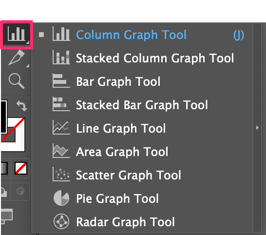
If you can’t find the tools on your toolbar, it’s because you’re using the basic toolbar. In this case, you’ll need to switch your toolbar to an advanced toolbar from the overhead menu Window > Toolbars > Advanced.
Found it? Let’s go ahead and make some graphs!
How to Use the Graph Tool in Adobe Illustrator
There are nine ready-to-use graph tools in Adobe Illustrator, and the method works similarly. Whichever tool you choose, you’ll be asked to fill data in the sheet, and it’ll create the type of graph you choose to make.
I’ll show you how to make a bar/column graph, line graph, and pie graph since they are more commonly used.
Example 1: How to make a bar/column graph in Illustrator
Bar graphs and column graphs are basically the same things, except the data is shown in different orientations. Well, that’s my opinion. Anyway, let’s start with the default column graph tool.
Step 1: Choose the Column Graph Tool from the toolbar, or use the keyboard shortcut J to activate it.
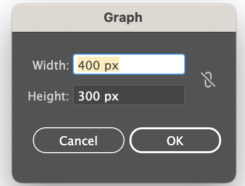
Step 2: Click on the artboard and input the size of the graph or you can directly click and drag on the artboard. Don’t worry about the size if you don’t have an exact value because you can resize the graph anytime.
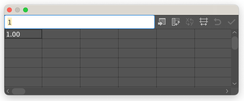
Once you click on the OK button, you’ll see a sheet where you can input the data of the graph.
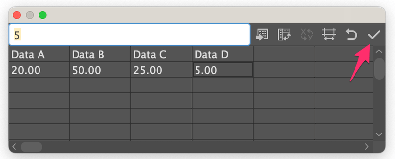
Step 3: Input the data. Click on the first box on the table and type in the attribute on the white bar above. Hit the Return or Enter key, and the attribute will show on the table.
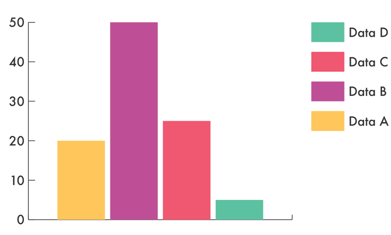
For example, you can put Data A, Data B, Data C, and Data D.
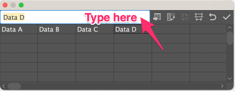
Then input the value of each attribute on the second row of the table.
For example, Date A is 20%, Data B is 50%, Data C is 25%, and Data D is 5%, so you can add the numbers 20, 50, 25, and 5 under the correspondent data.
Note: the numbers must add up to 100.
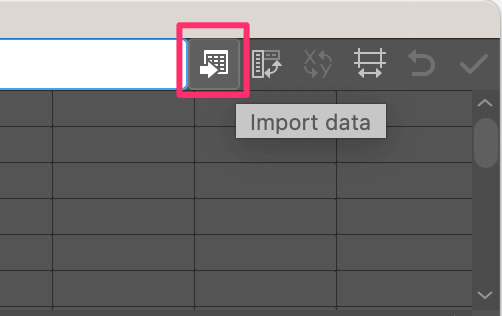
You can also import and edit a graph from Excel in Adobe Illustrator. So if you already have the data in Excel and don’t want to recreate it again, you can click on the Import Data button and choose your Excel file to import your data from Excel to Adobe Illustrator.
Once you input the data click the check button and close the sheet.
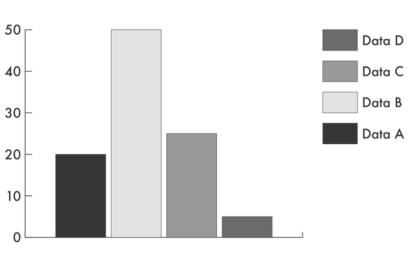
You’ll see the graph in grayscale, so the next step is to style the graph.
Step 4: Select the graph, and go to Object > Ungroup to ungroup the graph so that you can edit it. When you ungroup, you’ll get a message like this. Click Yes.
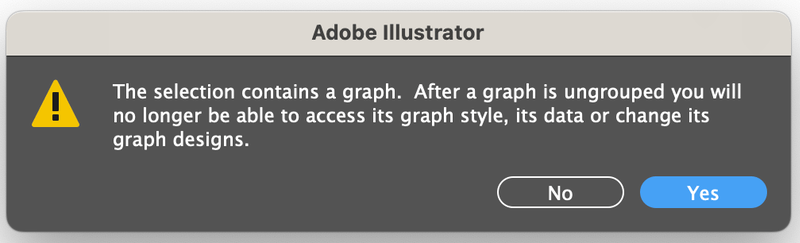
You’ll need to ungroup a couple of times because usually the text is grouped together and the shapes are grouped together in subgroups.
Note: once you ungroup it, you can’t change the data using the graph tool. So if you’re not 100% sure about the data, you should duplicate the graph just in case you want to make any changes.
Once you’ve ungrouped the objects, you can style the graph. You can change colors, add texture, add text, or even make a 3D column graph if you want. Starting with colors for example.
Step 5: Select the columns and change the colors. There are many ways to fill colors in Adobe Illustrator. If you can’t find your favorite color from the swatches, you can make your own swatches.
That’s it. Feel free to add more style to your column graph.

Now let’s take a look at the Bar Graph Tool. Input the same data as you did with the Column Graph Tool and you’ll get a basic bar graph like this.

You can use the same method I introduced above to style the bar graph. For example, besides changing the colors, here I resized the bars as well.

Example 2: How to make a pie graph in Illustrator
As I mentioned before, the method works similarly, so you can follow the same steps from Example 1 to make a pie graph. But in step 1, instead of choosing the Column Graph Tool, choose the Pie Graph Tool.
After you input the data, you’ll see the pie chart instead of the column chart.

There are fun things you can do with a pie chart, for example, making it 3D, half pie, or a donut pie chart.
Just some ideas to share 🙂

Example 3: How to make a line graph in Illustrator
The line tool is usually when you want to compare data between different timelines. It’s a bit more complicated than making a column or pie chart when you input the data on the sheet. Actually, it’s the same way you would input data in an Excel spreadsheet.
Quick example, an ice cream shop is asking 1000 people to vote for their favorite ice cream flavors, and here’s the data from the past year.
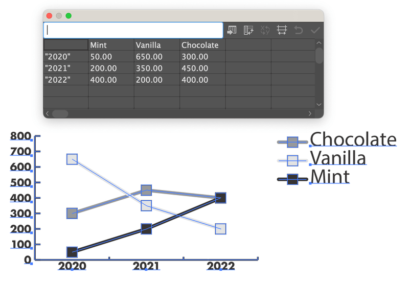
It didn’t look very stylish, right?
You can ungroup the objects and use the same method in Example 1 to style them. You can change the shape of the indicator, for example, I chose different shapes to represent the flavor.
Quick tip: If you’ve ungrouped all but want to select the same shapes or colors, you can go to the overhead menu and choose Select > Same > Appearance.
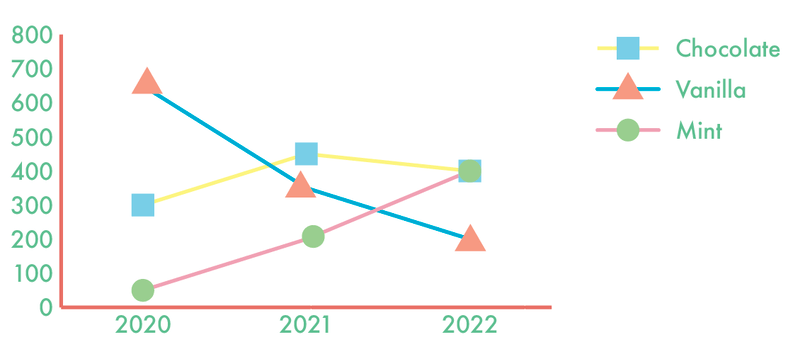
Looks better now?
Wrapping Up
The best thing about making graphs and charts in Adobe Illustrator is that you can style them easily and make data visualizations look great. The three examples in this tutorial should help you figure out the rest of the graph tools.
Again, it’s important to make sure that your data is accurate before ungrouping and styling the graph.
Ben Dunkle
What about the right-click Design option? Can’t get that to work.