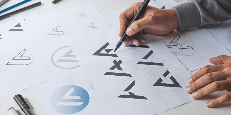
The first step to make a good logo is NOT in Adobe Illustrator. It’s on your mind. You need to brainstorm your brand identity, scratch out your ideas, and then create the logo in Adobe Illustrator. Believe it or not, once you have all the ideas and elements gathered, making a logo in Illustrator is the easiest step.
In this article, you’ll learn how to create a logo in Adobe Illustrator. I’ll also share some useful logo design tips along with the tutorial based on my experience working in branding for over nine years.
Depending on how you categorize and name it, there are three to seven types of logos. I won’t go over all of them here because the design concept is basically the same. Once you learn how to create the text and logo mark, you can make any form of logo you like.
Before getting started, I’ll quickly explain the different types of logos, mainly text logos and combination logos.
What is a Combination Logo?
A traditional logo consists of two key elements: text and shape. This type of logo is also called a combination logo and the two elements can be used together or separately. Many companies use a font-based logo because it’s more recognizable.
A combination logo is a logo that consists of both a wordmark (text) and a logo mark (shape). The text and icon can often be used together or separately.
Some combination logo examples are Microsoft, Adidas, Adobe, Airbnb, etc.
What is a Text Logo?
No, a text logo isn’t a typeface. There’s more to it.
A text logo can be called a wordmark or a letter mark. Basically, it’s a logo that shows the company name or initials.
Logos like Google, eBay, Coca-Cola, Calvin Klein, etc that show the name of the company are wordmark logos. Letter mark logos are usually a company’s initials or other short letters, such as P&G, CNN, NASA, etc.

Is that what you are trying to create? I’ll show you how to modify an existing font to make a text logo in the steps below.
Note: Screenshots from this tutorial are taken from Adobe Illustrator CC Mac version. Windows or other versions can look different.
How to Make a Text Logo in Adobe Illustrator
You can choose a font or create your own font for a text logo. Creating your own font for a text logo requires a lot of work, brainstorming, sketching, digitalizing the font, etc – starting from zero.
I recommend doing a lot of research before designing your logo. The most important thing is to have a clear idea of what your brand identity is, as this can determine what font and colors to use.
Honestly, depending on how original you want the logo, if it’s for quick use, modifying an existing font is much easier and you can make something cool.
For example, let’s say you want to create a text logo for a holiday fashion brand called This Holiday.
Step 1: Use the Type Tool (keyboard shortcut T) to add text to a new document in Adobe Illustrator. The text should be the name of the logo. I’ll put the brand name “This Holiday” here.

Step 2: Select the text, go to the Properties > Character panel, and choose a font.
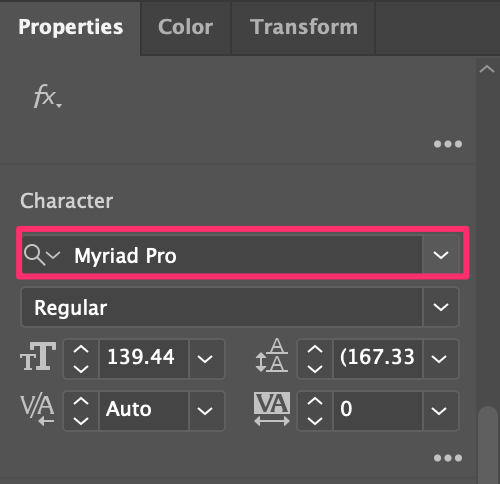
Make sure you double-check the font licensing before using a font for commercial purposes. I’d say Adobe Fonts is a safe go-to because, with your Creative Cloud subscription, you can use the fonts for free.
For example, I chose a font called Dejanire Headline.

Step 3: Use the keyboard shortcut Command + Shift + O to create a text outline. This step converts text into a path so that you can edit the shapes.

Note: Once you outline your text, you can’t change the font anymore, so if you’re not 100% sure about the font, duplicate the text a couple of times just in case you change your mind.
Step 4: Ungroup the outlined text so that you can edit each letter individually, and start modifying the text.

Honestly, there’s no rule for how to modify the text. You can use any tools you like. For example, I’m going to use the Eraser and Direction Selection Tool to touch up the edges of the font and slice part of the text.

Step 5: Add color to your logo, or keep it black and white.
A quick tip: It’s important to choose the right color because the color(s) should represent the brand and attract your target group. Statistics show that color improves brand recognition by up to 80%.
For example, if you’re making a logo for a kids’ brand, black and white only might not work great. On the other hand, if you’re designing a logo for elegant wear, simple black and white can be a great choice.
Since I’m making a text logo for a holiday fashion brand, I’d use some colors that represent a vacation – the color of the sea.

You can also distort the text. For example, I’m using the Envelop Distort to warp the text and make it wavier

This is a lazy solution but honestly, as long as you get the result you want, why not?
If you feel like it’s missing something and want to add a shape to your logo, keep reading.
How to Make a Combination Logo in Adobe Illustrator
A combination logo has text and brand marks. You can use the method above to create a text logo, and in this section, I’ll show you how to create a vector shape as your logo mark.
Creating a vector logo mark is basically creating a shape, but it’s not only about making a good-looking shape, you also need to think about how can the shape impact a business or a brand.
Instead of the technical steps of logo design, I’ll share with you how to come up with an idea for a logo design in the steps below.
Step 1: Brainstorming. Think about what the logo is for? And what can represent the industry? For example, let’s create a logo for a cocktail bar. So the elements that relate to the brand can be cocktail glasses, fruits, cocktail shakers, etc.
Step 2: Sketch your ideas on paper, or directly in Adobe Illustrator. If you don’t know where to start, you can start by tracing images with the elements.
Step 3: Create shapes in Adobe Illustrator. You can use the shape tools to create basic shapes, and then use the Pathfinder tools or Shape Builder Tool to combine shapes and create a new shape.
For example, I used the Rectangle tool, and the Ellipse tool to make an outline of a martini glass.
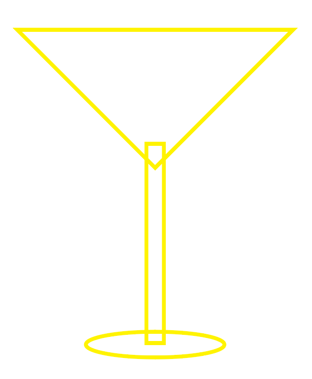
I’ll use Pathfinder’s Unite tool to combine the shapes.

See, now we have a basic shape. You can add as many details as you like.
You can also use the pen tool to trace your sketch or if you decide to use an image, then trace the image.
It all depends on the style of logo you’re making. Or you can even turn a photo into an illustration and make a logo from an image.
Tip: It’s highly recommended to use grids and guides when you design a logo.
Tip: If you really can’t come up with a good idea, you can use the logo templates from Adobe.
Step 4: Make the text logo part following the method above. For example, I’m going to name the bar “sip n chill”. Remember, the choice of font should be consistent with the shape. If you’re making a line logo, try to avoid using really thick fonts.

Step 5: Choose colors for the logo. If you want to keep it as a line logo, simply change the fill color to stroke.

Step 6: Decide the positions of the text and shape. Generally, a combination logo has two versions, the shape above the text, and the shape next to the text. But as I said, there’s no strict rule.

Step 7: Save the logo!
Tip: If you find it too challenging to design a logo from scratch, you can always get some inspiration from logo maker or logo generator tools and then recreate your own.
FAQs
When it comes to logo design, there are a lot of questions. If you still have doubts or want to learn more, this section has questions related to logo design that might help.
Is Adobe Illustrator good for making logos?
Yes, Adobe Illustrator is the best design software for logo design. I can’t say it’s the easiest software to use, because there’s a steep learning curve, but if you know how to use it, it’s definitely great for making logos.
Why do designers use Illustrator rather than Photoshop to create logos?
Designers normally use Adobe Illustrator to create logos because Adobe Illustrator is a vector-based program, which means, you can easily edit the logo. Photoshop is a raster-based software, which makes it more complicated to edit vector shapes.
What size should I design a logo in Illustrator?
There isn’t a “best size” for a logo. Depending on what you’re using the logo for, the logo size can be different. The good point of designing a logo in Adobe Illustrator is that you can resize the logo without losing its quality.
How to make a logo with a transparent background?
When you create a logo in Adobe Illustrator, the background is already transparent. You’re seeing a white artboard because of its default setting. The key is to choose a Transparent background when you save/export the logo as a png.
Final Thoughts
A lot of people think that logo design is difficult. But I’d say that the steps are actually not that hard if you know how to use the tools, the most difficult part about logo design is brainstorming.
It can take you hours or even days to come up with a concept, but it’ll only take you hours to actually do the artwork in Adobe Illustrator.
If you’re interested in learning more about logo design, you can also read my logo statistics article where I collected some logo statistics and facts 🙂
